Your cart is currently empty!
I Hate Marsala, the Pantone Color of the Year for 2015
I’ve been stewing with this for a couple of days, guys. Marinating if you will. I wanted to be absolutely sure before I said with all certainty…
I hate Marsala, the Pantone Color of the Year for 2015.
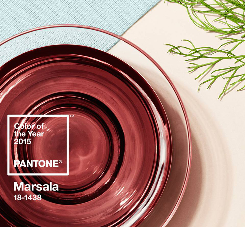
Oh sure, the wine-themed color looks appetizing when it’s a photo of actual marsala wine. I’m way on board with putting this color in my mouthhole at the end of a long work day. But have you seen the color swatch?
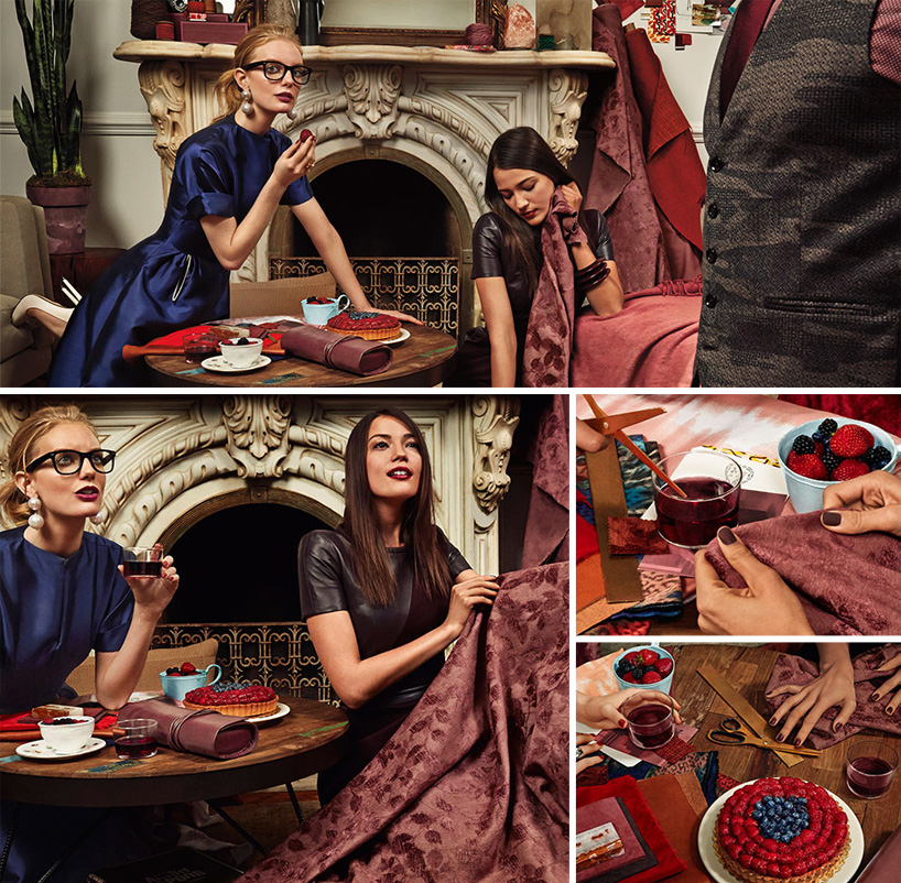
But I’m serious, that chick in the blue dress had way too much marsala if she thinks those drapes her friend is picking out are a good idea.
Here’s a list of 10 awful things the 2015 Pantone Color of the Year Marsala reminds me of:
- Baby poop
- Old moldy strawberries that have been sitting in the back of the fridge for too long. And you rememeber them like a month later, and they look kind of dusty and sad.
- Dried blood on the carpet in a mob boss’ office.
- A sad smear of ketchup from hamburgers past.
- Vomit
- One of those really, really old houses with sheets over all of the furniture that probably has a poltergeist in it plotting to kill you.
- Scabs
- My hair when it’s gone too long between dye jobs. (Note to self, dye hair next week) (Also note to self, hold off on hair dye, your washed out red is about to be super on trend)
- Road kill
- It’s almost mauve. Guys, it’s almost MAUVE.
Now remember, the pantone swatch is a starting point to reference – you can interpret the trend with richer tones, lighter tones, punch it up a bit… What I hate is the specific Pantone chip. It’s awful. It’s flat. It’s sad. In comparison with bright happy colors of the year… I’m just kind of super bored by it.
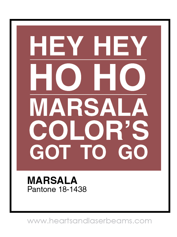
Make yourself feel better – print this for your office:
Now I’ll tell you – I don’t always hate the Pantone color of the year. In fact, I’m usually totally on board. Enthusiastically. Check out these awesome colors from Pantone years past:
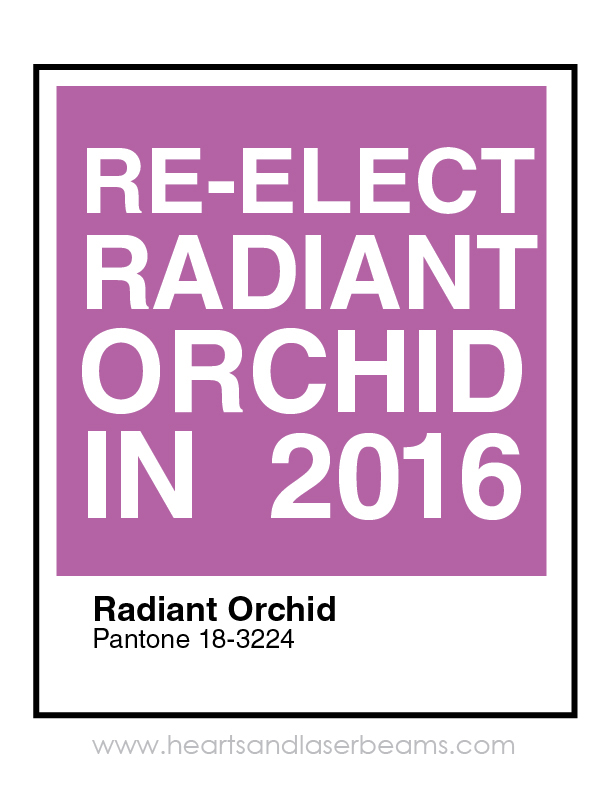
Radiant Orchid was such a slam dunk – I know of literally no person ever that doesn’t like a good shade of purple, and there’s just so dang much you can do with it. It didn’t even have to be a major player in your color scheme – just a little pop and boom you’ve got yourself a winner.
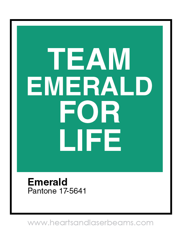
Personally, Emerald might have been my favorite Pantone color of the year of all time. I don’t really have one set color that’s my all time favorite, like OMG I HAVE TO HAVE EVERYTHING PANTONE 360C! (That’s a good kelly green. Nerd alert.) I generally like lots of bright colors… But if I had to pick… Bright greens are always gonna be near the top of the list.
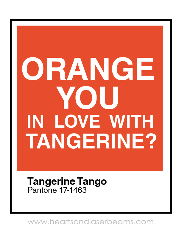
Tangerine Tango could be a little rough to pull off depending on where you’re trying to use it, for the simple fact that not everyone loves orange. And some people hate it. Me? I’m a fanilo of the Manilo.
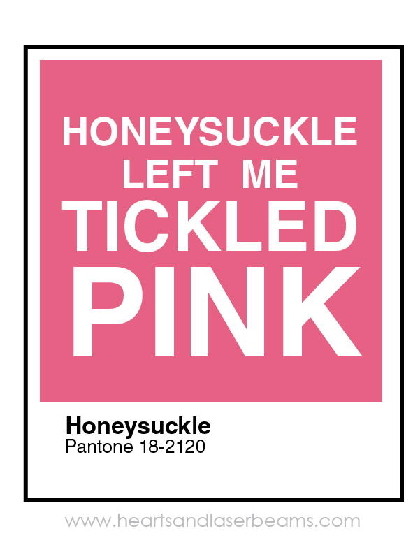
Pink’s another easy one – you can’t go wrong with pink. And you thought it was coincidence that dudes started wearing pink shirts a few years ago.
Do you hate Marsala as Pantone’s Color of the Year for 2015 like I do?
12/8/14 Update: Two more things Marsala reminds me of. Raw hamburger meat that’s been sitting in the fridge for like a week too long. You meant to put it in the freezer because you never got around to making that Hamburger Helper, and you forgot, and now you have old hamburger meat in your fridge that you have to throw out. Also, it reminds me of that worn out knit bodysuit you bought at Contempo Casuals in 1997. It started out a really nice deep wine color, and it’s just been through the wash too many times because that snap crotch bodysuit was SO IN STYLE.


Freelance illustrator Steph Calvert is an award-winning artist with 24 years of experience working as a creative professional. She is based in McDonough, Georgia, just south of Atlanta.
Steph Calvert has expertise as a children’s book illustrator. She is an expert surface pattern designer for art licensing and creates line drawings for publishing and product design. Steph has years of additional expertise as a mural artist, creating original art, and logo design for small businesses. She is currently querying literary agents with her first author/illustrator book projects.
Writing CLIENTS INCLUDE
Moonfrye.com
OC Weekly
Educational Highlights
National SCBWI Conference, 2023
Illustration Summer Camp – The Highlights Foundation, 2021
Make Art That Sells, 2017
BFA in Computer Art – SCAD, 1999
One response to “I Hate Marsala, the Pantone Color of the Year for 2015”
LOL! Thank you for sharing 🙂